The “pie” chart type is rendered as a circle. Each data point is displayed as a slice out of the circle. This chart type is useful to show the size of values relative to one another. One example may be the number of orders made by each employee – the largest slice of the pie is taken by the employee who made the most orders.
To use “column” chart type, add the keyword “column” to any “pivot-” tag, and make sure that it is separated with hyphens (-).
| Data Field | Tag |
| EmployeeID | pivot1-row1-pie |
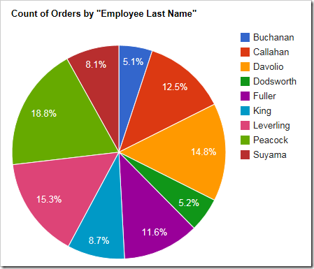
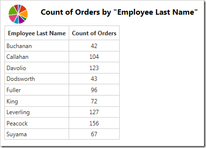
The data for the chart can be seen below.
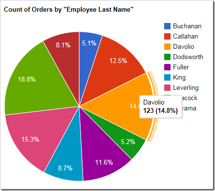
If the slice is large enough, the percentage value is displayed. Hovering over or clicking on a slice will reveal the data.
If there are too many slices, the chart may become unreadable to the users. Use “topX”, sort the row values, and enable “Other” row to ensure that only the largest X number of slices are displayed, and the rest are collapsed.
| Data Field | Tag |
| EmployeeID | pivot1-row1-pie-top5-other-sortbyvalue |
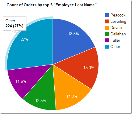
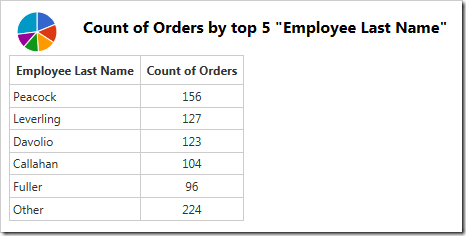
The sorted top five rows and “Other” row can be seen in the data below.
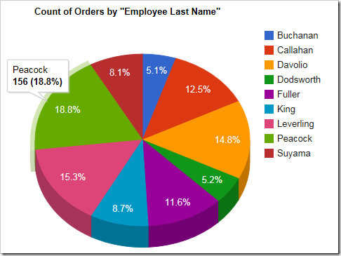
The pie can also be rendered as a 3D pie by using the “pie3d” chart type instead.
| Data Field | Tag |
| EmployeeID | pivot1-row1-pie3d |
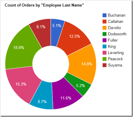
The chart can also be rendered with a hole in the center by specifying the “donut” chart type.
| Data Field | Tag |
| EmployeeID | pivot1-row1-donut |
