Database Lookups

Labels
AJAX(112) App Studio(9) Apple(1) Application Builder(245) Application Factory(207) ASP.NET(95) ASP.NET 3.5(45) ASP.NET Code Generator(72) ASP.NET Membership(28) Azure(18) Barcode(2) Barcodes(3) BLOB(18) Business Rules(1) Business Rules/Logic(140) BYOD(13) Caching(2) Calendar(5) Charts(29) Cloud(14) Cloud On Time(2) Cloud On Time for Windows 7(2) Code Generator(54) Collaboration(11) command line(1) Conflict Detection(1) Content Management System(12) COT Tools for Excel(26) CRUD(1) Custom Actions(1) Data Aquarium Framework(122) Data Sheet(9) Data Sources(22) Database Lookups(50) Deployment(22) Designer(178) Device(1) DotNetNuke(12) EASE(20) Email(6) Features(101) Firebird(1) Form Builder(14) Globalization and Localization(6) How To(1) Hypermedia(2) Inline Editing(1) Installation(5) JavaScript(20) Kiosk(1) Low Code(3) Mac(1) Many-To-Many(4) Maps(6) Master/Detail(36) Microservices(4) Mobile(63) Mode Builder(3) Model Builder(3) MySQL(10) Native Apps(5) News(18) OAuth(9) OAuth Scopes(1) OAuth2(13) Offline(20) Offline Apps(4) Offline Sync(5) Oracle(11) PKCE(2) Postgre SQL(1) PostgreSQL(2) PWA(2) QR codes(2) Rapid Application Development(5) Reading Pane(2) Release Notes(184) Reports(48) REST(29) RESTful(29) RESTful Workshop(15) RFID tags(1) SaaS(7) Security(81) SharePoint(12) SPA(6) SQL Anywhere(3) SQL Server(26) SSO(1) Stored Procedure(4) Teamwork(15) Tips and Tricks(87) Tools for Excel(3) Touch UI(93) Transactions(5) Tutorials(183) Universal Windows Platform(3) User Interface(338) Video Tutorial(37) Web 2.0(100) Web App Generator(101) Web Application Generator(607) Web Form Builder(40) Web.Config(9) Workflow(28)
Archive
Blog
Database Lookups
Wednesday, May 23, 2012PrintSubscribe
Configuring a Radio Button List

The Radio Button List items style is useful when there is a need to select a single option from a short list.

For example, the Ship Via Company Name field on the Orders edit form uses Lookup item style by default. A lookup may be useful with a large number of records to choose from. However, there are only three shipping companies in the Northwind database, making a lookup redundant. Let’s change this lookup into a radio button list.

Ship Via Company Name field rendered as a lookup on the Orders edit form.

Start the Project Designer. In the Explorer, switch to the Controllers tab and double-click on Orders / Fields / ShipVia field node.

ShipVia field in the Orders controller in Code On Time Project Explorer.

Change the following properties:

Property New Value
Items Style Radio Button List
Data Value Field ShipperID
Data Text Field CompanyName

Press OK to save the field, and press Browse on the tool bar. Navigate to Orders page and edit a record.

Ship Via Company Name field is now rendered as a radio button list. The “N/A” option appears because the field is not mandatory. If more shippers are added to the Shippers table, then more options will be available in the list.

Ship Via Company Name field rendered as a Radio Button List on the Orders edit form.

The radio button list can be rendered in multiple columns. Switch back to the Project Explorer and double-click on Orders / Views / editForm1 / c1 – Orders / ShipVia data field node.

ShipVia field in Orders controller presented in Project Explorer.

Make the following changes:

Property New Value
Columns 2

Press OK to save the data field, and click Browse on the tool bar.

When the web application opens in your default web browser, navigate to Orders page and edit a record. There are now two columns of radio buttons for the Ship Via Company Name field.

Ship Via Company Name field rendered as a Radio Button List in two columns.

Friday, May 4, 2012PrintSubscribe
Configuring an Auto Complete Field

Code On Time web application generator assigns Lookup item style to all foreign key fields.
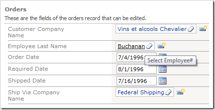
'EmployeeID' field rendered as lookup in Code On Time web application

The Lookup item style has powerful searching and filtering capabilities, but may require several clicks to find a record. A speedy alternative to the lookup is the Auto Complete items style. The user types in a value in the field, and a list of matching field entries will be displayed.

Open the Project Designer. In the Explorer, switch to Controllers tab. Double-click on Orders / Fields / EmployeeID field node.
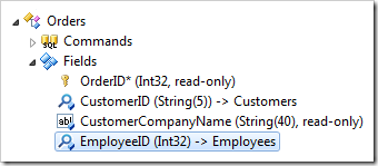
'EmployeeID' field from Orders controller in Code On Time Project Explorer

Change the following properties:

Property New Value
Items Style Auto Complete
Data Value Field EmployeeID
Data Text Field LastName

Press OK to save the field. On the tool bar, click Browse to generate the application.

When it opens in your default web browser, navigate to Orders page and edit an order. Click on the dropdown arrow, and you will see a list of all options.
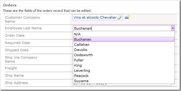
Employee Last Name data field as auto complete showing full list of available options

Close the dropdown and type in the letter “d”. A list of matching employees whose last name start with “D” will appear.
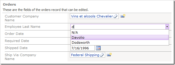
Auto Complete results from typing in 'd' in 'EmployeeID' field

Now type “o”, and that list of employees will narrow down to those that have last names that start with “Do”.
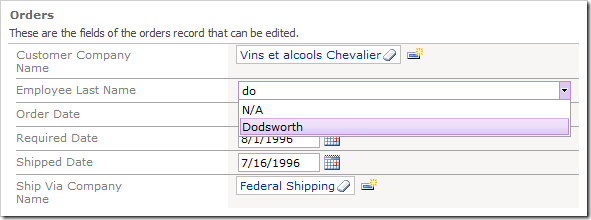
Auto Complete results from typing in 'do' in 'EmployeeID' field

You can now hit Tab or Enter on the keyboard, or click on the list item, to insert it into the field.
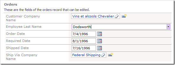
Option selected from list of auto complete list items

If the entered text does not match to any items in the list, then the input field will revert to the original value.

Let’s make this field take less real estate on the users screen.

Switch back to the Designer. In the Project Explorer, double-click on Orders / Views / editForm1 / c1 – Orders / EmployeeID data field node.
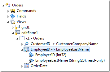
EmployeeID data field in editForm1 view of Orders controller configured with Auto Complete items style

Change the following setting:

Property New Value
Columns 20

Press OK to save the data field, and click Browse on the tool bar.

Navigate to Orders page, and edit a record. The data field is now twenty characters wide.
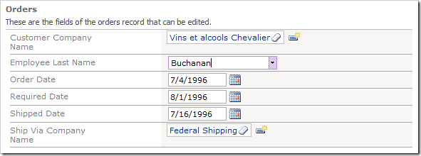
EmployeeID data field is now 20 characters wide

Friday, May 4, 2012PrintSubscribe
Configuring a Check Box

The Discontinued field in the Products controller is a Boolean field. By default, Code On Time web application generator assigns Drop Down List style to fields of this type, which allows “Yes”, “No”, or “(select)” options to be selected. The “(select)” option represents null, “Yes” represents True, and “No” represents False.

'Discontinued' field with items style of 'Drop Down List'

However, this field is mandatory, and can only be in two states — True or False. It would be more convenient to the end user if this field was presented as a Check Box.

Start the Project Designer. In the Explorer, switch to the Controllers tab. Double-click on Products / Fields / Discontinued field node.

Discontinued field of the Products controller in the Project Explorer

Make the following changes:

Property New Value
Allow null values False
Code Default 0
Items Style Check Box

Press OK to save your changes. On the tool bar, click on Browse to generate the application.

When the application opens in your default browser, navigate to Products page. You will see that Discontinued field is now a check box.

'Discontinued' field now displayed as a Check Box

In the grid view, the Discontinued field is rendered as a check box as well.

Discontinued field rendered as check box in Products grid view

The text displayed to the right of the Check Box in form view can be changed using the Header Text property of the data field.

Switch back to the Design environment. In the Project Explorer, double-click on Products / Views / editForm1 / c1 – Products / Discontinued data field node.

Discontinued data field in the editForm1 data view of Products controller

Change the following property:

Property Value
Header Text This product is no longer available.

Press OK to save the data field, and press Browse on the tool bar. Select a record on the Products page. You will see the new Header Text is displayed to the right of the check box.

'Discontinued' check box data field with a custom Header Text